JTECH Business Package
ROLE
Project management, print vendor communication, branding, visual design, proofreading, press check
JTECH is an industry leading communications technology company specializing in onsite paging and text messaging software for the hospitality, healthcare, retail, and other industries.
Overview
When HM Electronics bought JTECH, JTECH was still using its original 1980s logo. People often read the last mark as a “Z,” causing confusion. The logo also used a gradient, so it couldn’t be reproduced with solid Pantone inks.
Problem
Since JTECH was the most recognized onsite paging solutions provider, it was important to not alter the brand too much so their existing customer base could still easily identify the company after the acquisition. After exploring several ideas, the approved design still retains the overall look and color palette of the original.
Solution
THOUGHT PROCESS
The original logo was almost 30 years old when I was tasked to modernize it. I knew the first problem to solve was removing the “Z” shape, which I achieved by using it’s general shape to alter the “H” of the logo to replicate it. To not stray away from the original brand too much, I used a similar red and applied it to the J. To emphasize the “J” even more, I modified the typeface to extend the character past the baseline.
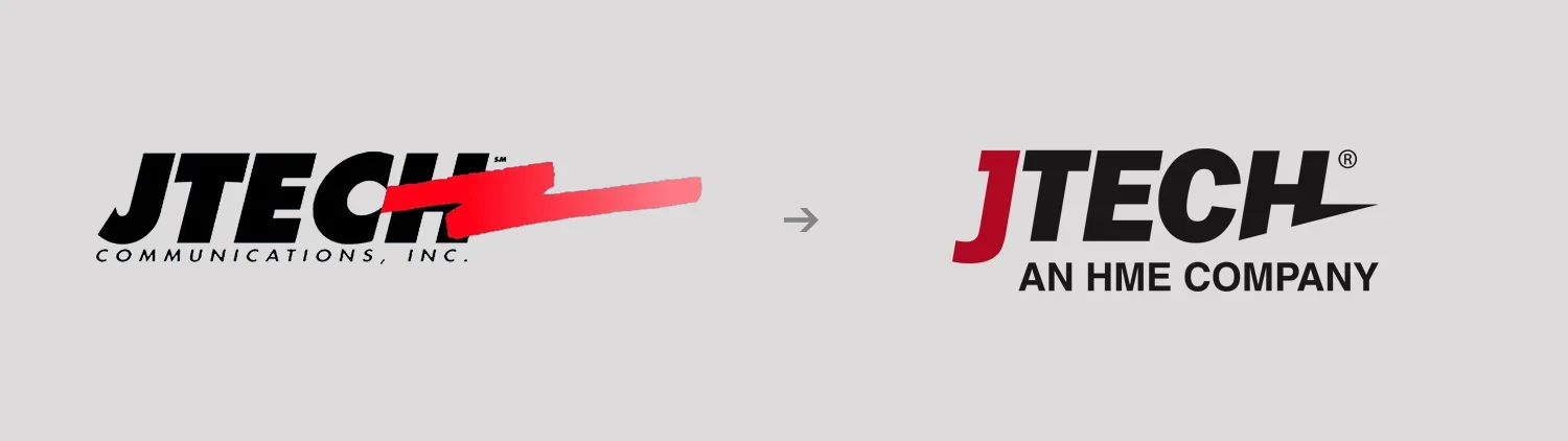
Before and after of the JTECH logo, retaining elements of the original design while still modernizing and making it more legible.
Stakeholders were immediately pleased with the new design, acknowledging the design decisions without needing the explanations. The existing customer base were able to recognize the company was under new ownership but had the impression their service would not be changed. Printing product labels, business cards, letterheads, and other collateral was more cost effective since it could be done using only 2 inks.
Results
IMPACT
Easily communicated new ownership
New logo was still associated with the original company
Printed collateral became more cost-effective
Company name was more legible
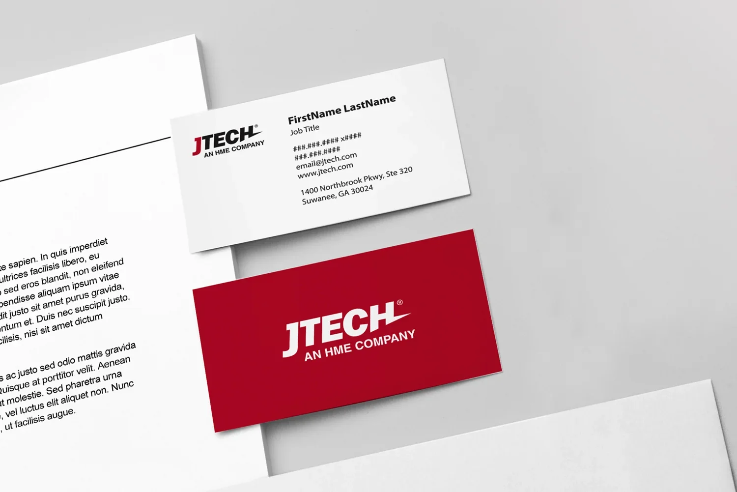
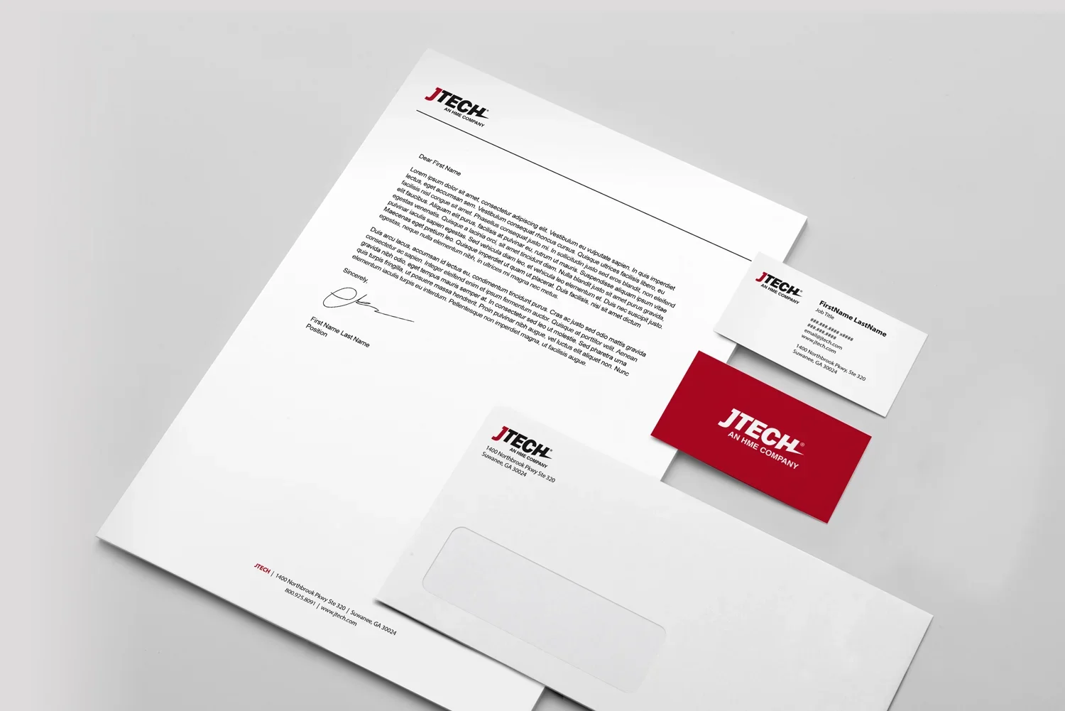
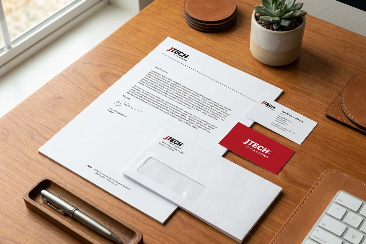
Branded business package including business cards, envelopes, and letterhead.